
Every paint colour I used in our 1890s cottage home redesign

Of all the questions I’ve received about my home since our redesign a few years ago, this is easily the most asked: what paint colours did you use? In this piece I’m sharing every shade I used, inside and out, along with where each has been applied.
I think there’s a common assumption that if your taste leans understated, colour doesn’t play much of a role in bringing a space to life. But that couldn’t be further from the truth. Choosing not to go bold with colour doesn’t mean defaulting to all white. And even when you do use whites, the ones you choose can completely shift the feel of your home and how you experience a space. In any home, colour is one of the most powerful tools you have — get it right, and you’ve given yourself the strongest possible foundation for the rest of your design.
The colours in my home are simple, warm and earthy. Choosing softer tones isn’t about avoiding colour — it’s about using it with intention. When your palette is more restrained, the colours you do choose almost have to work harder. They need to carry more weight in shaping mood, depth and atmosphere, because you’re not relying on big colours to do the heavy lifting, and you don’t want the space to fall flat.
The goal for my home was always to create a space that felt calm and connected, a home that heroed the natural landscape outside. I wanted it warm without feeling heavy, minimal but never cold. I wasn’t chasing trends or dramatic contrasts; but I did still want some variation. I was looking for tones that would soften the space, shift beautifully with the light, and reflect the way we like to live.


Interior Palette
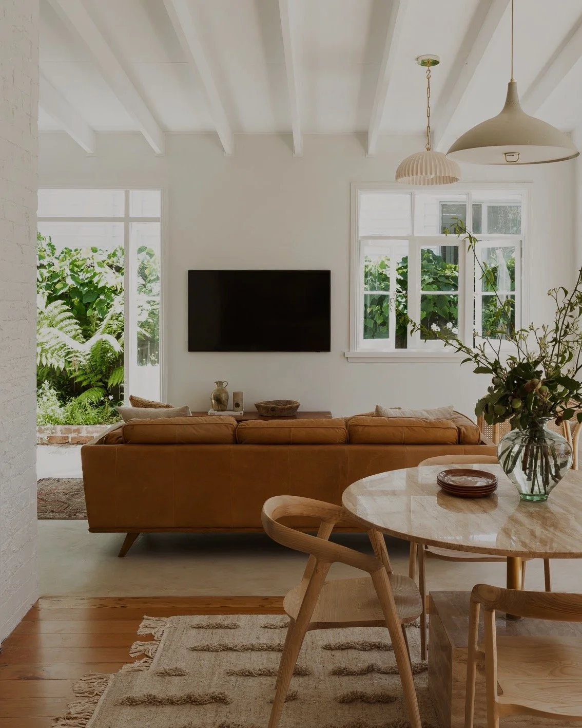
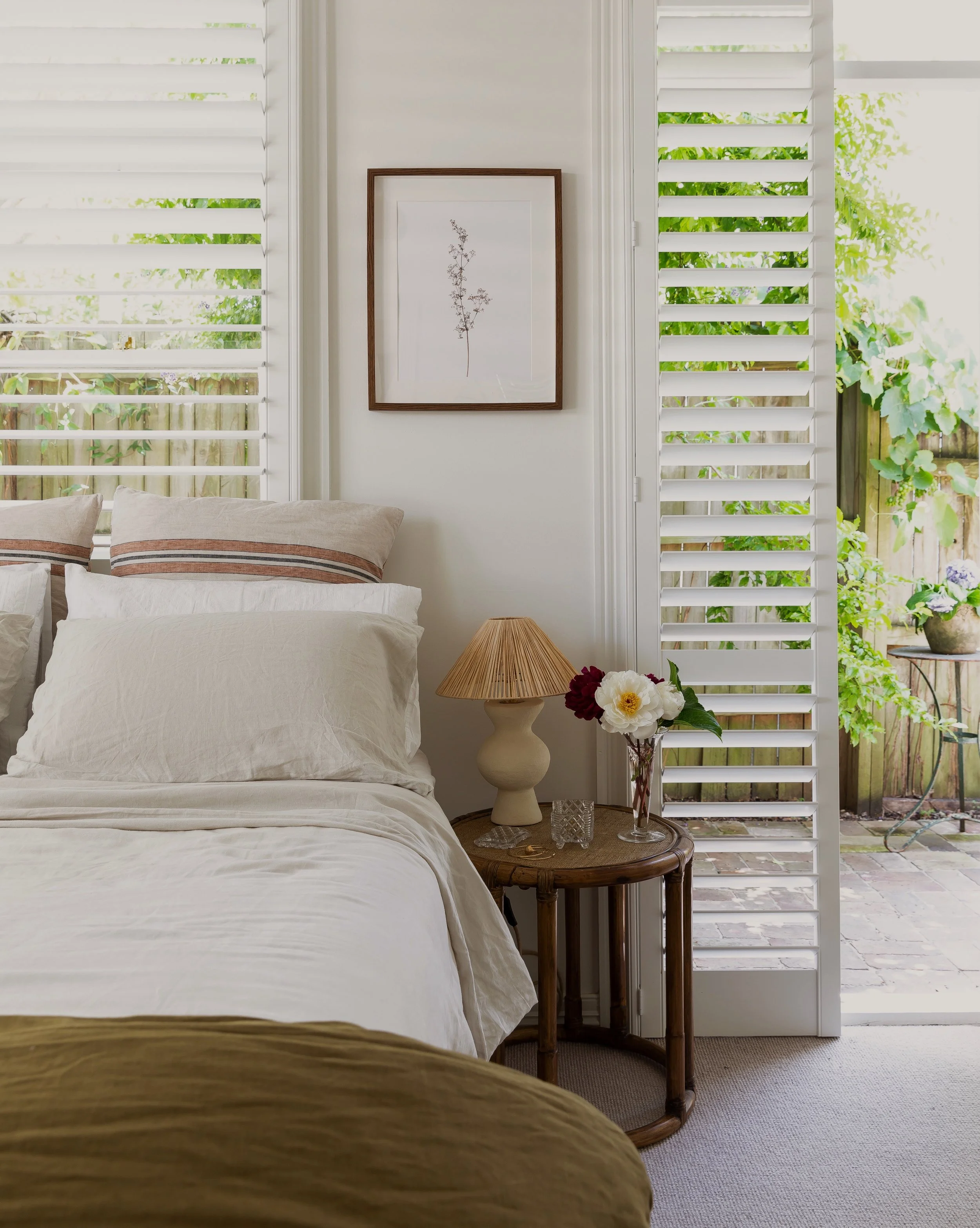
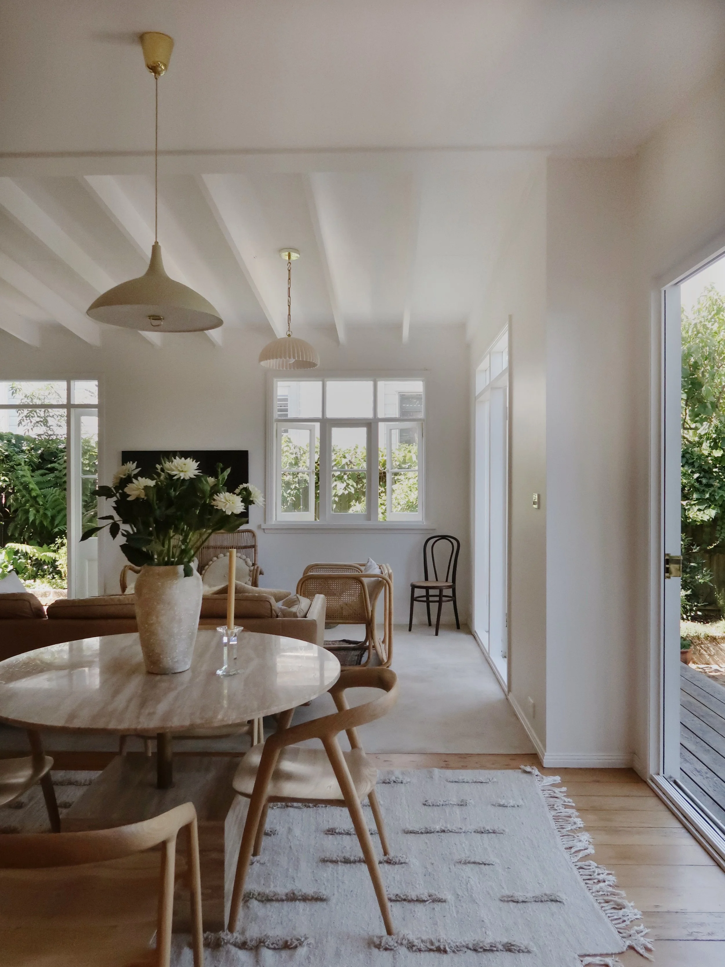
I kept things tonal and soft throughout. I wanted a palette that didn’t demand attention, just one that made the space feel calm and earthy.Ceilings
Ceiling White by Dulux (Flat Acrylic). A true flat white. No sheen, just clean and quiet above.
Cabinetry (kitchen and one bathroom)
Dulux Stone Master. I actually laugh thinking back to how much I deliberated over this colour. It was the first colour I picked and I loved it straight away, but then second-guessed myself and tested a hundred different paints, before ending up right back where I started and knowing that this was the one. It was a good lesson in trusting my intuition. I couldn’t be happier with this colour, not once since we renovated have I wanted to change it or grown sick of looking at it — always a good sign that you’ve picked well!
Walls (kitchen, living, bedrooms, bathrooms, laundry)
Natural White by Dulux (Wash & Wear Low Sheen). I love the warmth of this white. It softens the space and plays so nicely with the natural light. Dulux actually categorise it more as a neutral, but I find it’s pretty warm. If you don’t like whites that throw some yellow, this one isn’t for you.
Skirtings, Architraves, Doors, Windows & Frames
Natural White by Dulux (Semi Gloss). I used the same colour as the walls, but in a semi-gloss for a subtle contrast. It adds definition without drawing attention.
Exterior Palette
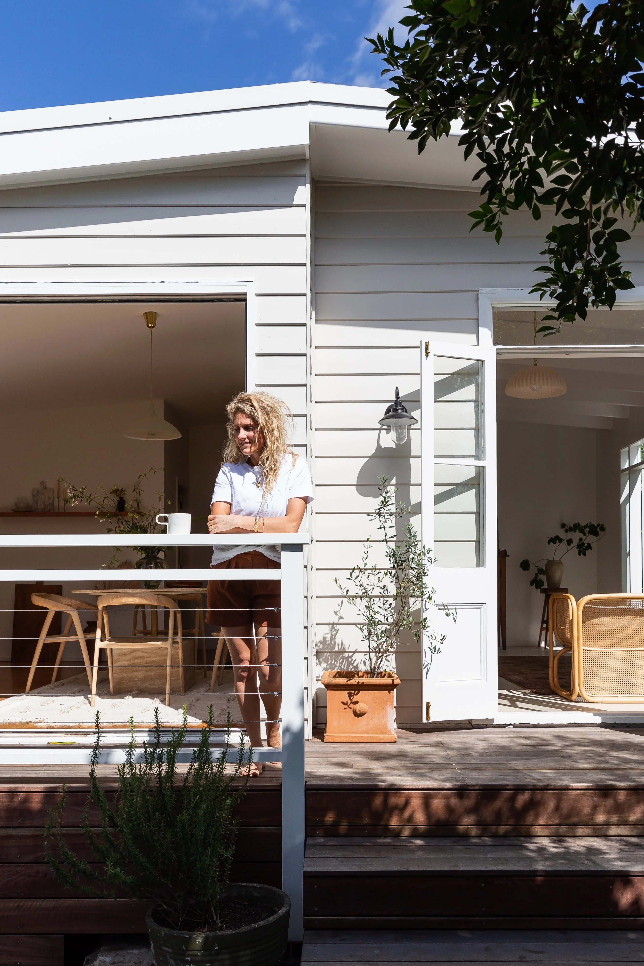
I wanted our colours to flow from indoors to outside. The colours needed to dance with the landscape and our surrounding garden, not compete with it. We’ve got a 1890s weatherboard cottage, so the panelling breaks up the colour really nicely. 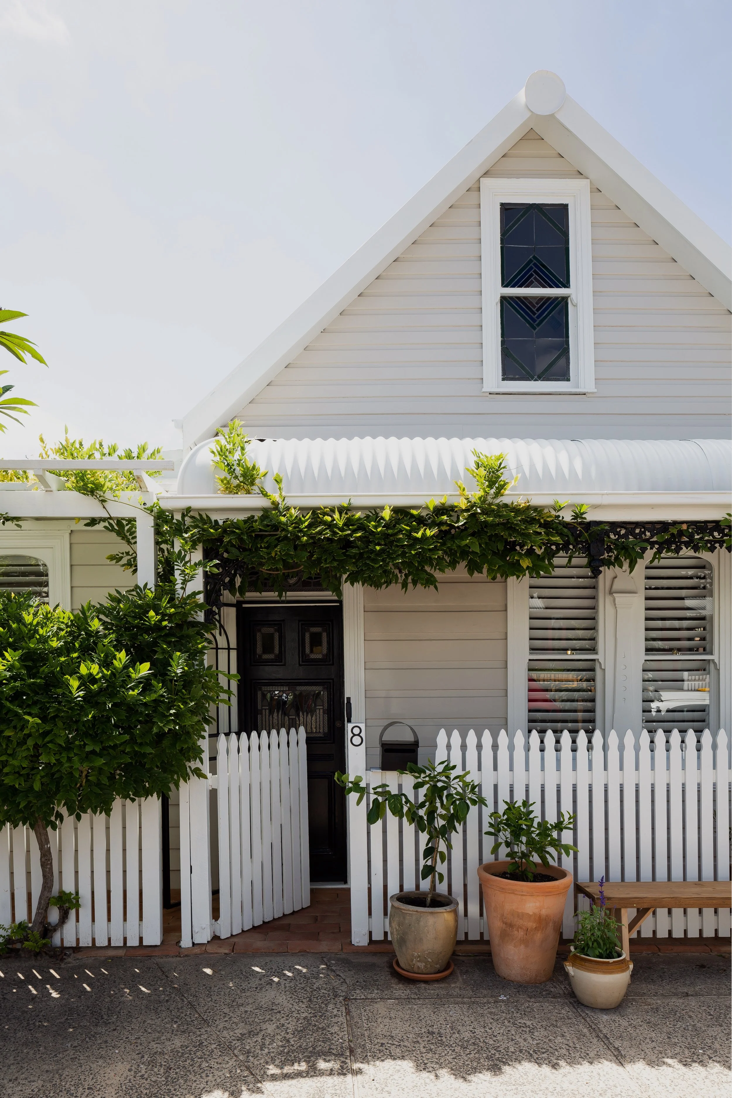
Weatherboards
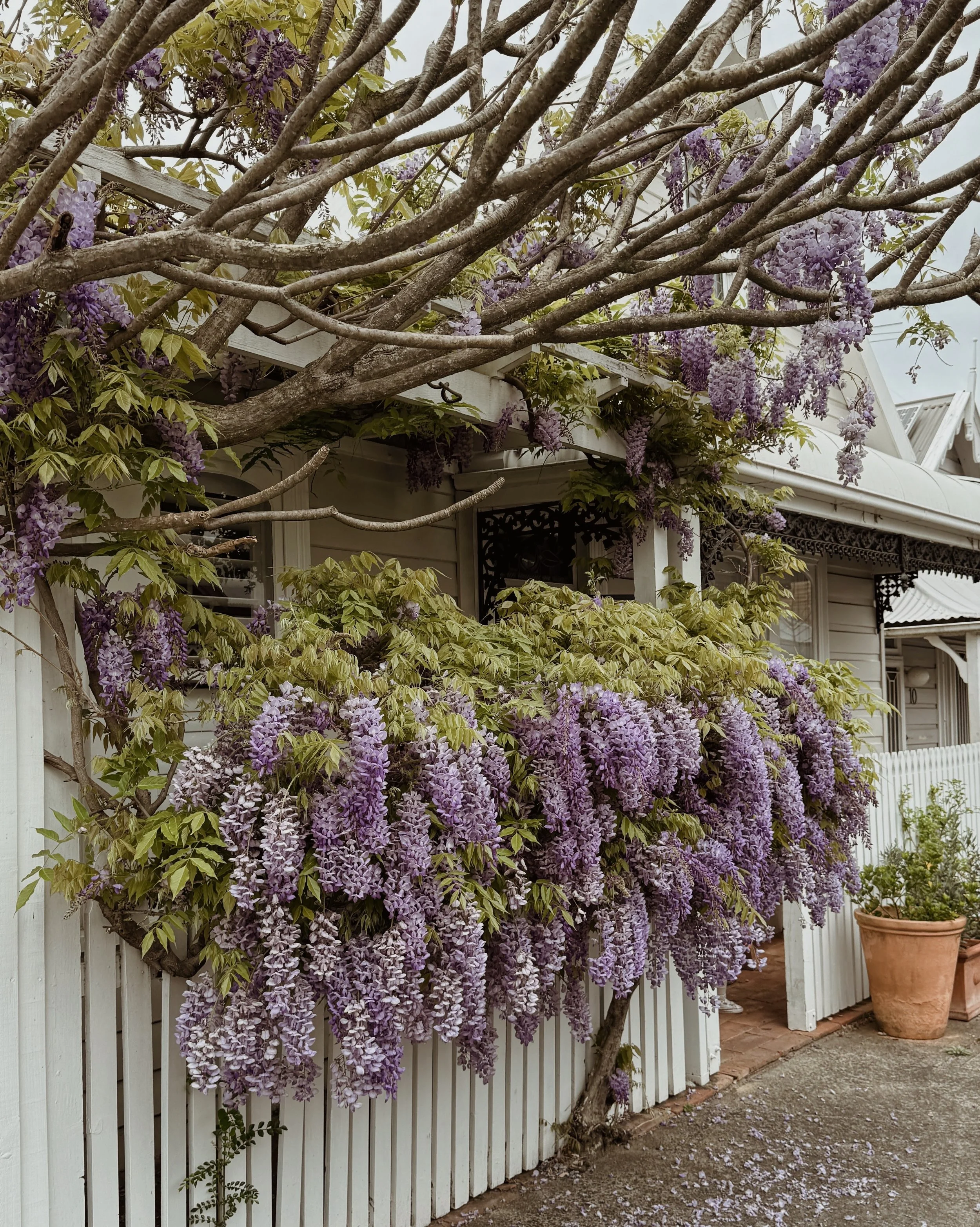
Beige Royal by Dulux (Low Sheen). This is a warm, mushroomy neutral that shifts so nicely with the light. It instantly made the exterior feel softer and more grounded (you’d hope so, the entire cottage was bright pink and green before our reno). We have the most insane wisteria out the front of our home and in Spring when it’s in full bloom it looks so beautiful next to this colour. Making sure this colour would work in with our garden was key to my paint decision here.
Bullnose Roof / Roof
Surfmist Colorbond. A soft, light-reflective grey-white. When we first painted it, I was worried it felt too stark in full sun; it’s much whiter than I anticipated. I’m used to it now.
Front Fence & Gate, Door Frame, Fascias, Posts, All Window Frames & Gutters
Whisper White by Dulux (Semi Gloss). A warm white that adds a little lift to the front façade without overpowering the palette. I used this consistently across the trim to create a clean, finished look. Really happy with this one.
Front Door, Lacework & Letterbox
Black Gloss by Dulux. High gloss black, used sparingly. It grounds everything and gives the front just the right amount of contrast.
So there you have it, all the colours in my home!
Choosing the right colours isn’t just about finding something that looks good on a paint swatch, it’s about creating a backdrop for how you want to feel in your home. Think about the colours you’re naturally drawn to, the ones you love wearing, and take your time with this decision, because it’s one of the most important. And as I always remind my clients, colours can look completely different depending on natural light and room orientation, so be sure to test generously sized samples in the actual space and watch how they change throughout the day.
Happy painting! Hx
